In what I’m sure is a great relief to everyone and their families, we’re finally entering a more efficient era of mascot staffing: with the exception of Sochi, every Games from now on elegantly pairs a single Olympic mascot with a more-or-less well-matched Paralympic mascot.
That doesn’t mean that what comes next will be easy—in just a moment you’ll be face-to-face with London’s conceptually-overwrought and aesthetically-ghastly mascot duo—but it does streamline the process of writing this newsletter, which I think we can all celebrate.
London, Summer 2012: Wenlock and Mandeville
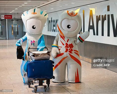
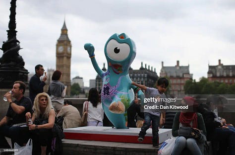
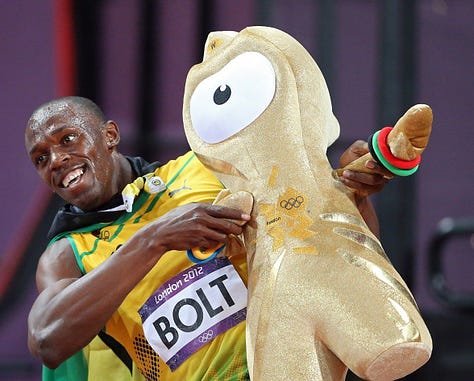
After speaking so negatively about these guys just moments ago, I find my heart beginning to soften. Are they pleasant to look at? Do they make any sense? No and no, but they’re also doing something, and they gave the world something to talk about.1 And perhaps that alone makes them worthy of love.
Anyway, what are they? They are…guys. Their lore is that they were made from drops of the steel (apparently steel comes in drops?) used to construct London’s Olympic Stadium. Wenlock, the Olympic mascot and the one that’s more orange-y, has a head that represents both London taxi cabs and the roof of the Olympic Stadium. For some reason their eyes are cameras which are supposedly always recording, which many have pointed out has an Orwellian vibe. Wenlock gets his name from the English town of Much Wenlock, which hosted a 19th century precursor to the Olympics; Mandeville, our Paralympic mascot, is named for the Stoke Mandeville Hospital, which hosted a midcentury forerunner to the Paralympics.
The internet really hated them and had lots of fun talking about how bad they are, which I do think is fair. They drove design critic Stephen Bayley to wonder: “What is it about these Games which seems to drive the organisers into the embrace of this kind of patronising, cretinous infantilism?” Their creator Grant Hunter gamely responded to the haters pointing out that they are mostly intended for an audience of children and therefore it doesn’t matter if they look stupid. Touché I guess!
Sochi, Winter 2014: Hare, Leopard, Polar Bear, Snowflake, and Ray of Light
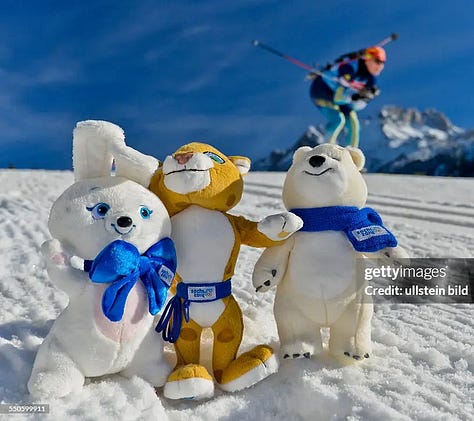
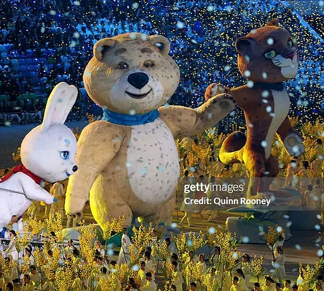
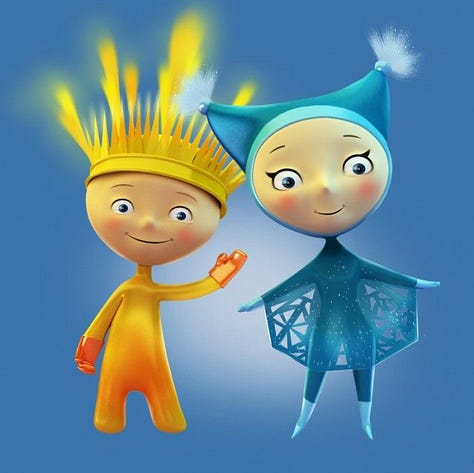
These Olympic mascots—which don’t have names and instead are identified only by their species—have such an off-putting bootleg energy to me. They look like they belong in a mid-2000s animated commercial for a European budget supermarket, designed by someone who loves cigarettes significantly more than they love creating art. The Paralympic mascots were created by different artists and have a superficially different vibe but somehow have captured the same dead-eyed energy as their Olympic counterparts.
The Olympic mascots were theoretically chosen based on the results of a public online vote—an election tainted by several controversies:
An early frontrunner was Zoich, a bright blue frog with a ski pole in his mouth and Olympic Rings as rotating pupils in otherwise vacant eyes. Zoich fans initially believed him to be a fan-submitted joke candidate, which in classic internet fashion got him tons of votes and publicity, which then turned out to be exactly what the Sochi organizers wanted: Zoich was planted from the start to bring attention to the online mascot poll before being unceremoniously removed before the last round of voting.
Later in the process, Russian folk figure Ded Moroz (who appears to be kind of like a Russian Santa Claus) took a solid lead in the voting. But then he was mysteriously removed from the online poll after then-Prime Minister Vladimir Putin said he loved the snow leopard the best.2 With Ded Moroz out of the running, the snow leopard took the lead, eventually winning a spot on the mascot roster to the chagrin of many. “It’s hard to imagine a more ridiculous mascot,” said one Russian blogger quoted in Time, who perhaps had never laid eyes on Wenlock and Mandeville.
You may recall Misha, the massively popular brown bear mascot of Moscow 1980? His consistently-very-disgruntled creator saw the Sochi polar bear mascot as a Misha knockoff and was quoted in Time saying, “I don’t like being robbed.” Speaking with insidethegames.biz, Sochi 2014 head honcho Dmitry Chernyshenko cheerfully framed the resemblance as a good thing: “The Moscow mascot was very popular and is still very popular in our country and it can certainly bring some positives to us as we see our silver polar bear as the grandson of Misha the Bear.” Grandfather-grandson drama!!
Anyway, according to theolympicdesign.com, Leopard is “an advanced internet user.”
Rio de Janeiro, Summer 2016: Vinicius and Tom
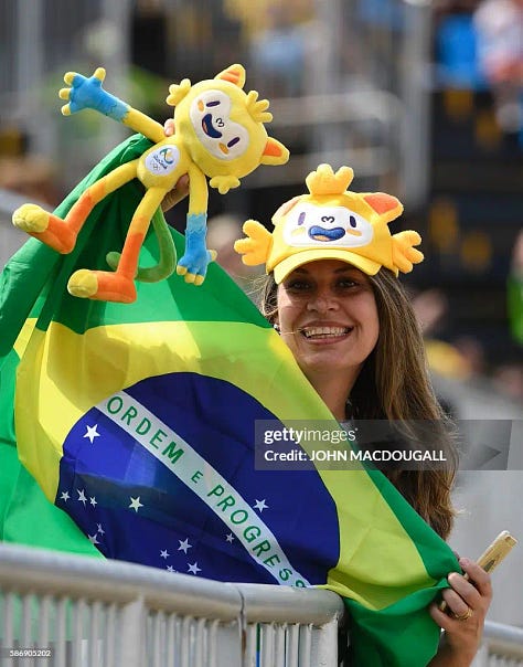
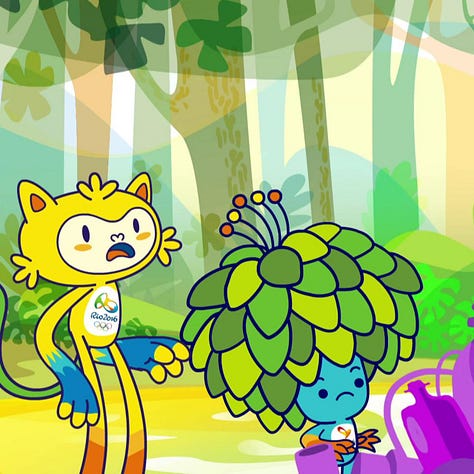
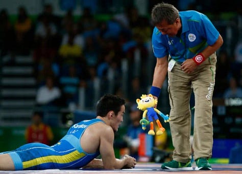
I find myself somewhat overcome with emotion looking at Vinicius and Tom, my two best friends. Vinicius and Tom are named after the co-writers of “The Girl from Ipanema.” Their designs bring together diverse elements of Brazilian nature, including jaguar ears, a monkey face, macaw hands, and a flower tail for Olympic mascot Vinicius and turtle feet, membrane hands, leafy hair, and a tadpole tail for Paralympic mascot Tom. They were created by a nine-person design team including a man literally named Paulo Muppet. They had their own 32-episode TV show on Cartoon Network Brazil! I know you probably won’t watch this, but here is a video of Vinicius impersonating Gisele Bundchen at the Paralympic Opening Ceremony.
Vinicius had a particularly important role in Rio’s wrestling competitions. Apparently in wrestling, when a coach wants to challenge a referee’s call, they’re supposed to throw a soft object on the mat, but it doesn’t particularly matter what that object is. Often coaches will just throw a hunk of foam? But someone on the Olympics organizing team who deserves to make one million dollars a year had the idea to give coaches Vinicius plushies to use as “challenge bricks.” They had ones in red shirts and ones in blue shirts so that two competing coaches could each use a Vinicius that looked distinctive!!
Pyeongchang, Winter 2018: Soohorang and Bandabi
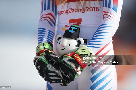
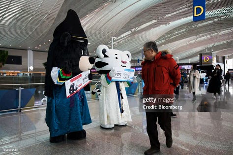
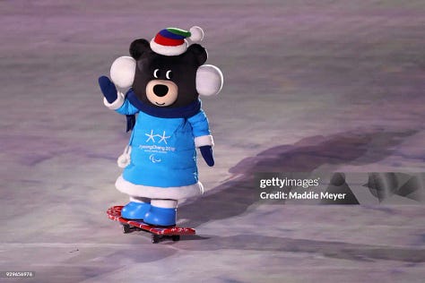
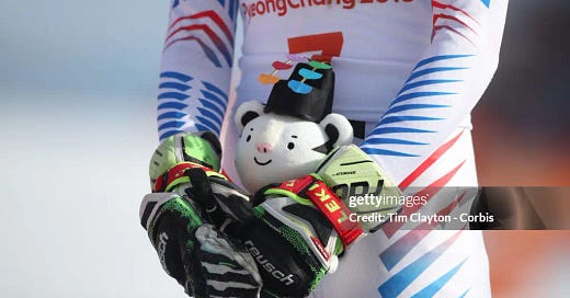
Soohorang and Bandabi—the mascots for the Olympics and Paralympics respectively—are a fun remix of Hodori and Gomdoori, the bear-and-tiger mascots from the Seoul Games 30 years earlier. Soohorang takes his name from the Korean words for “protection” and “tiger”; white tigers are a national symbol for South Korea and are also very cute. This duo was super popular and relatively uncontroversial as Olympic mascots go. A blogger from SportsLogos.net pronounced them “not too creepy or terrifying,” which at this point you’ll recognize to be high praise within the Olympic mascot genre.
In an interview with The Korea Herald, Lee Hee-gon—Chief Marketing Officer of Mass C&G, the design firm that created Soohorang and Bandabi—convincingly explained why their heads are so big: “What is special about it in comparison with other Olympic mascots is that it has so many facial expressions, just like human beings do. In order to put them onto its face, we decided to enlarge the head. And we knew by fact that people tend to prefer big heads in characters. Big heads make them more adorable.” Case closed!
One thing that perhaps only one person talked about: Medium blogger Georgina Voss made a very fun if not-100%-convincing argument that W&M are “genderqueer icons” due to their lack of visible sex characteristics and wide variety of outfits. Honestly, I’m rolling with it!
The party line for why Ded Moroz was removed from the mascot voting was that if selected, the character would become intellectual property of the IOC, which would be sort of like Santa Claus becoming intellectual property of the IOC, which does seem like it would be bad. He still might have been a better mascot than what we ended up with, though.




It just seems like it should be easier to make a good one??????
and so true big heads do make things more adorable